Bloomify is an app that is used alongside the new (theoretical) EcoStudy spaces we are planning on building on campus. The goal of the EcoStudy space is to provide a calming and stress-reducing environment for students to work. The app Bloomify allows students to reserve seats, make appointments with the mental health resources available the University of Colorado Boulder, and track students well-being over the course of a week.
Bloomify is an app created by my partner, Adrian Bryant and myself. My role in this project was to create sketches on what the EcoStudy might look like and to create the "Appointments" and "Reserve" wireframes through Figma for our Bloomify app.
Problem Space
Problem: Stressed students who are disconnected from nature.
Audience: University students.
Solution: An area that provides a calm, study area where students can reserve seats and check in with CU mental health.
Research
After sending a survey out to 14 University of Colorado students, we gained a lot of information for our EcoStudy project. We found that 28.5% of students find it difficult to find a study spot on the CU campus, and many students feel the CU Mental Health website is difficult to navigate.
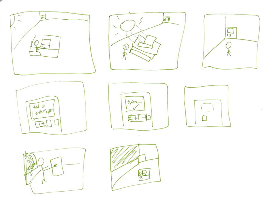
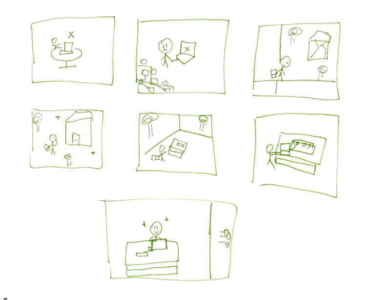
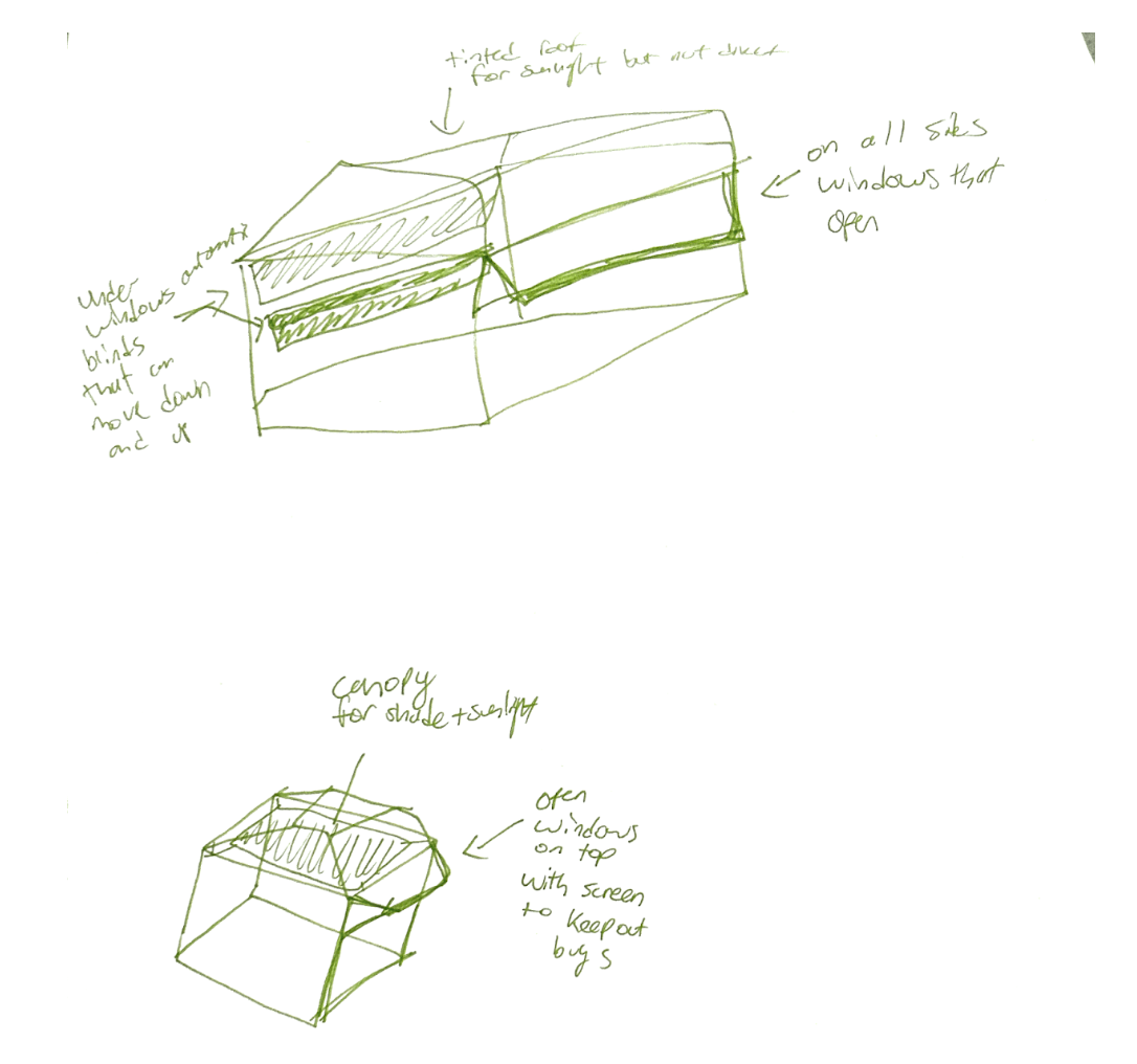

Sketches
Here are some rough sketches of how we envisioned our EcoStudy to be.


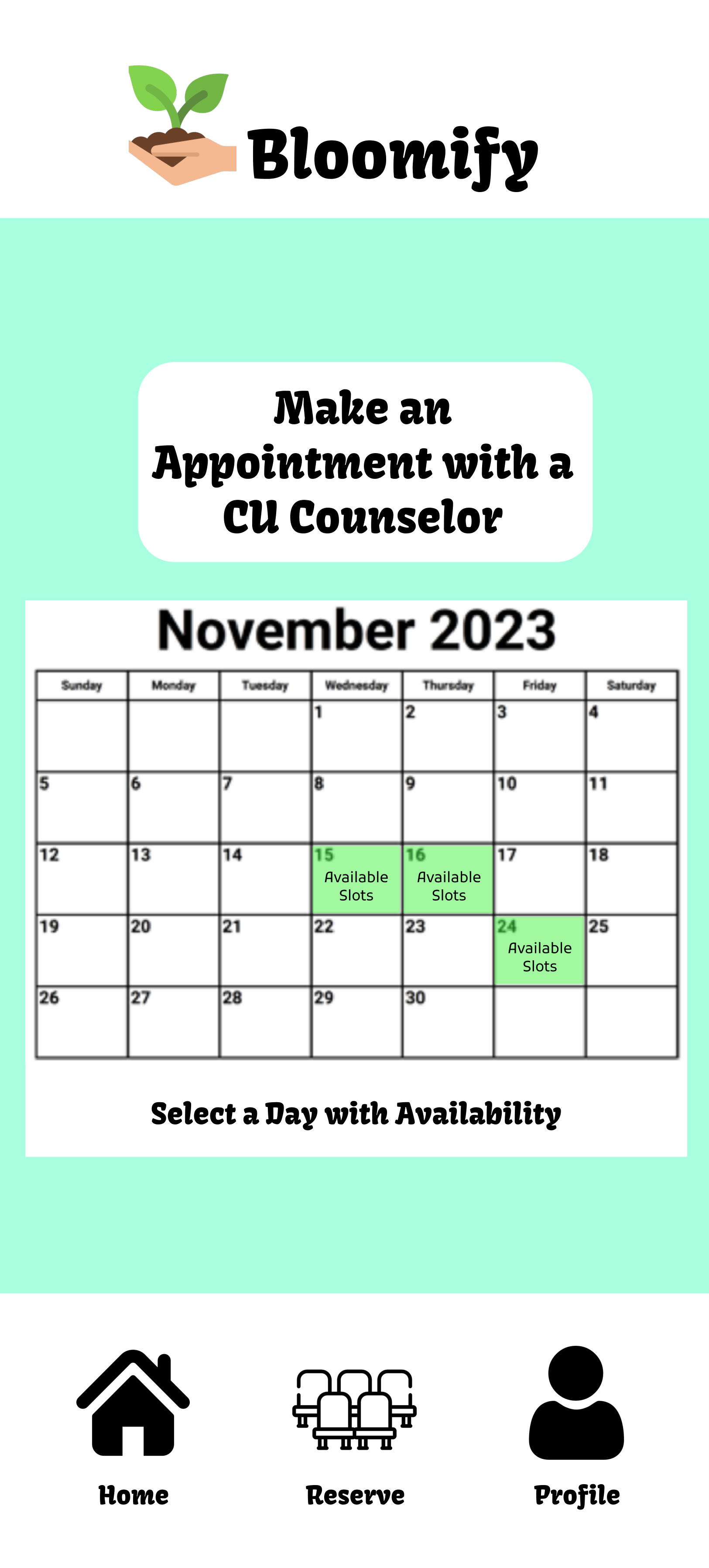




Prototype #1
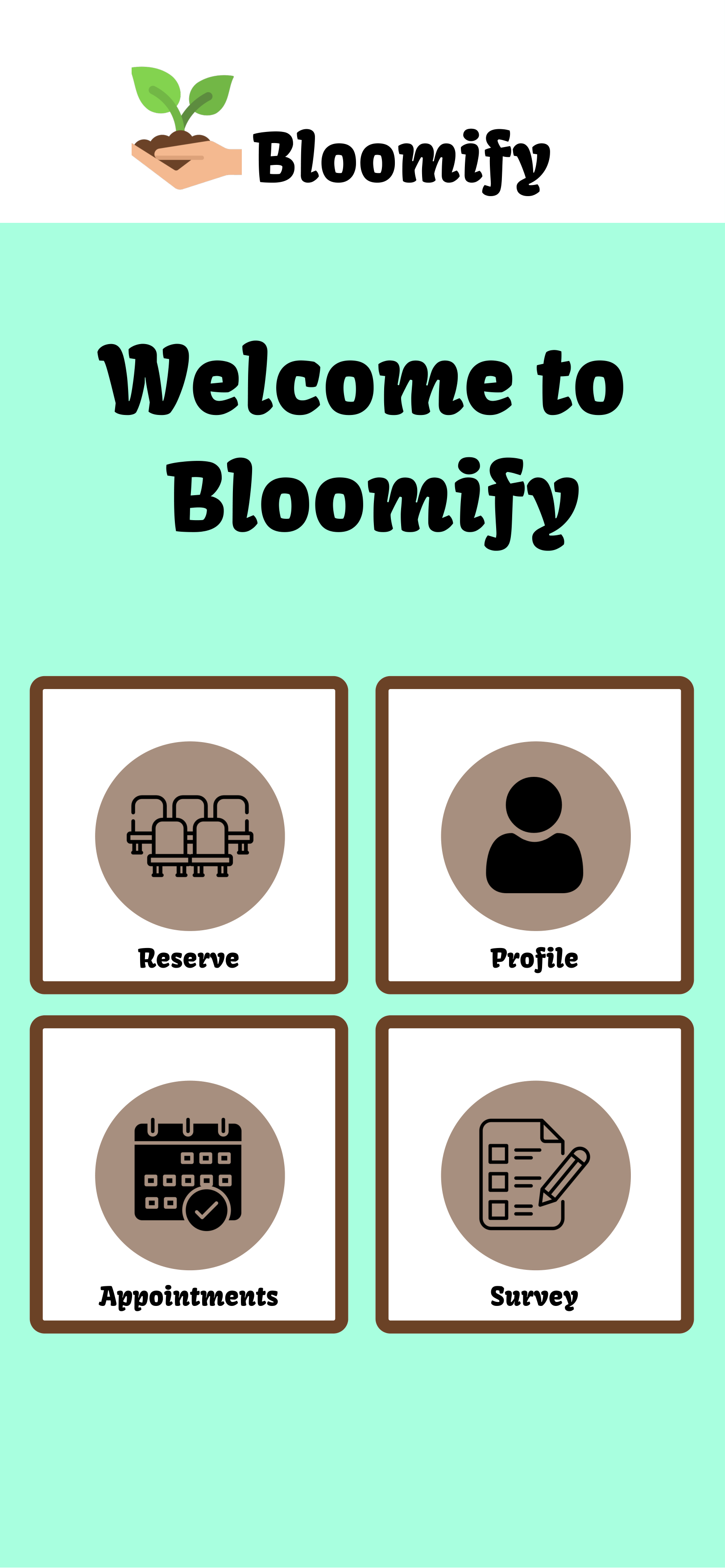
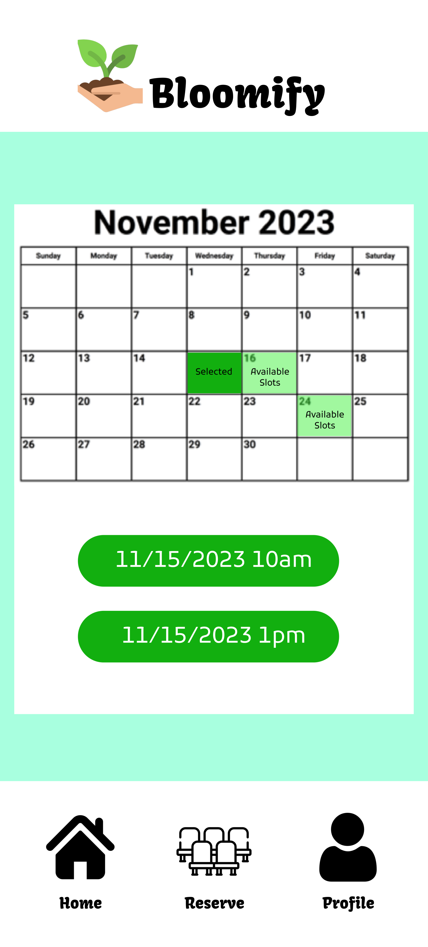
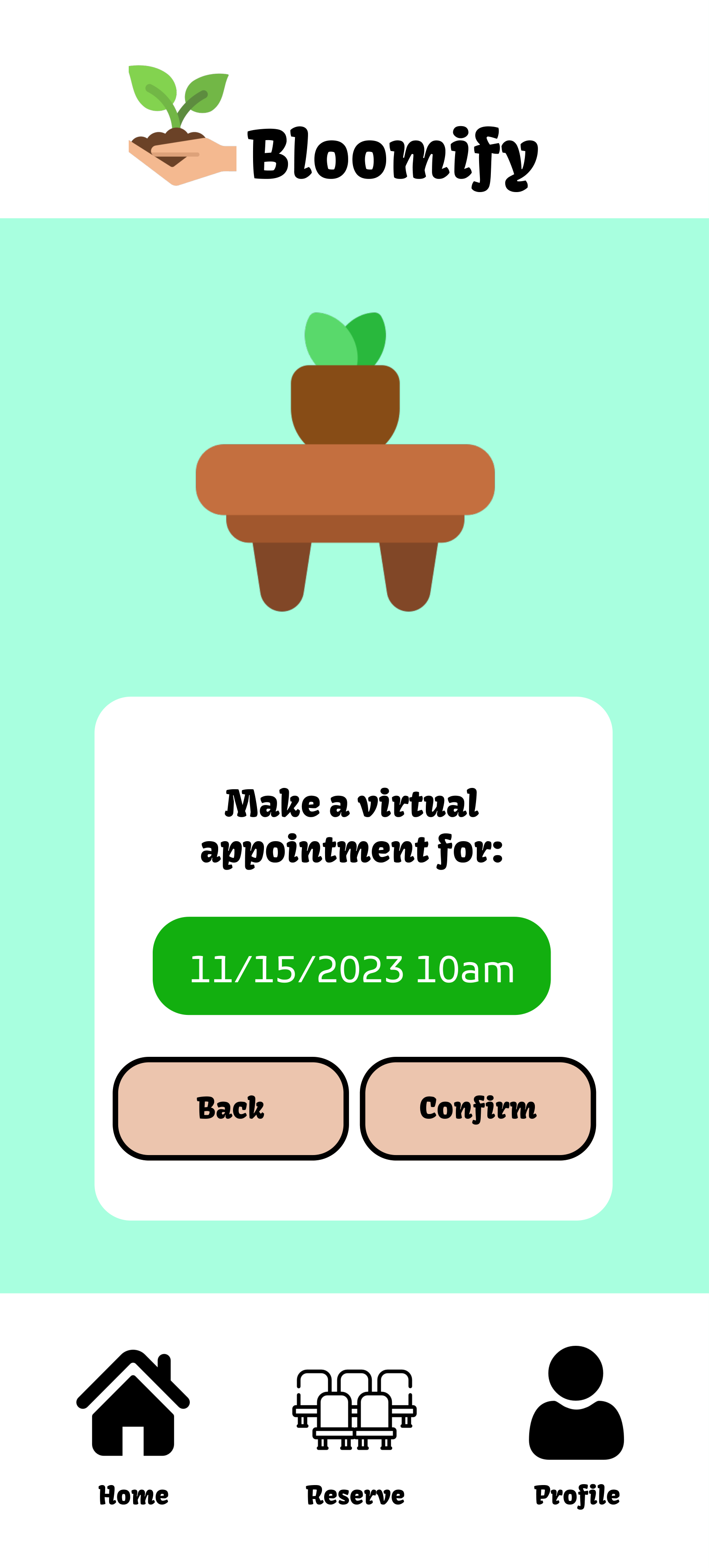
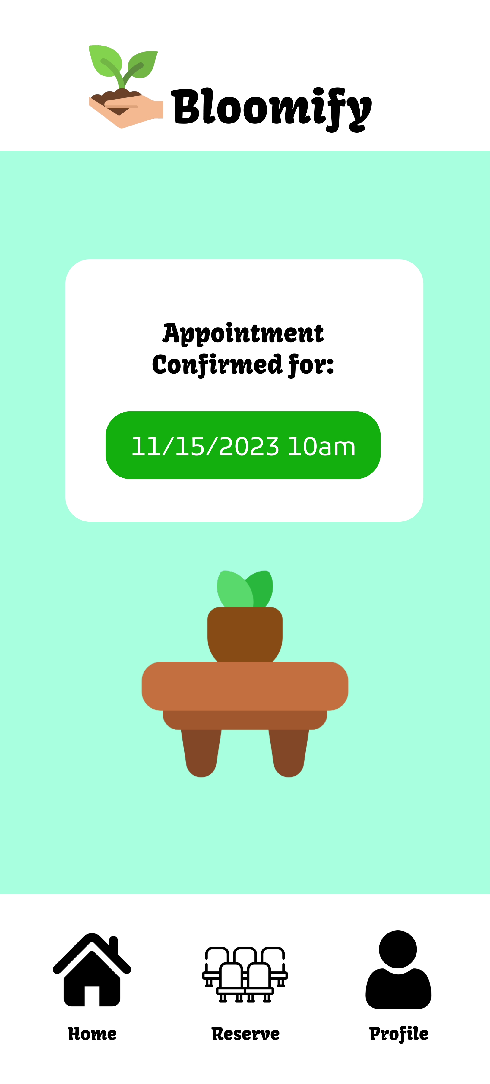
In the pictures displayed are the panels I specifically worked on.
The appointments feature, I've used a similar process from past projects, aiming to improve it. Users confirm their chosen time and day, and it's displayed for their final approval.
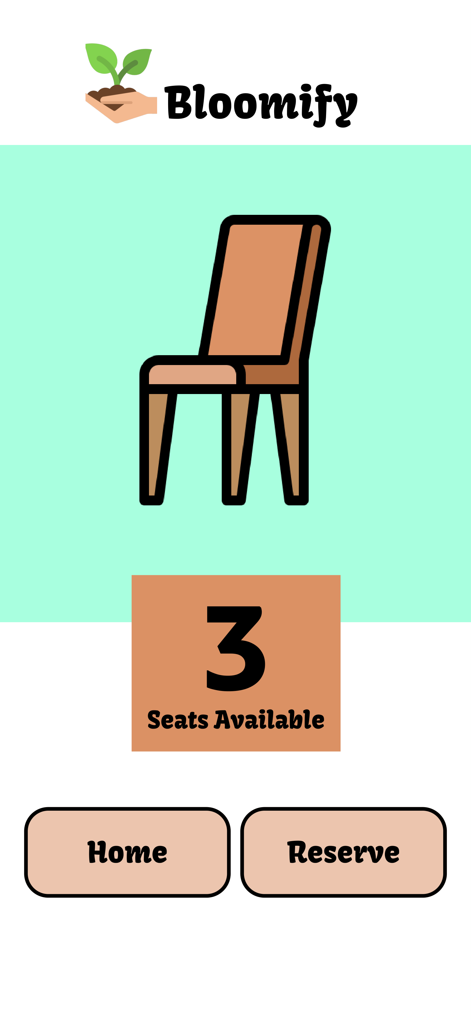
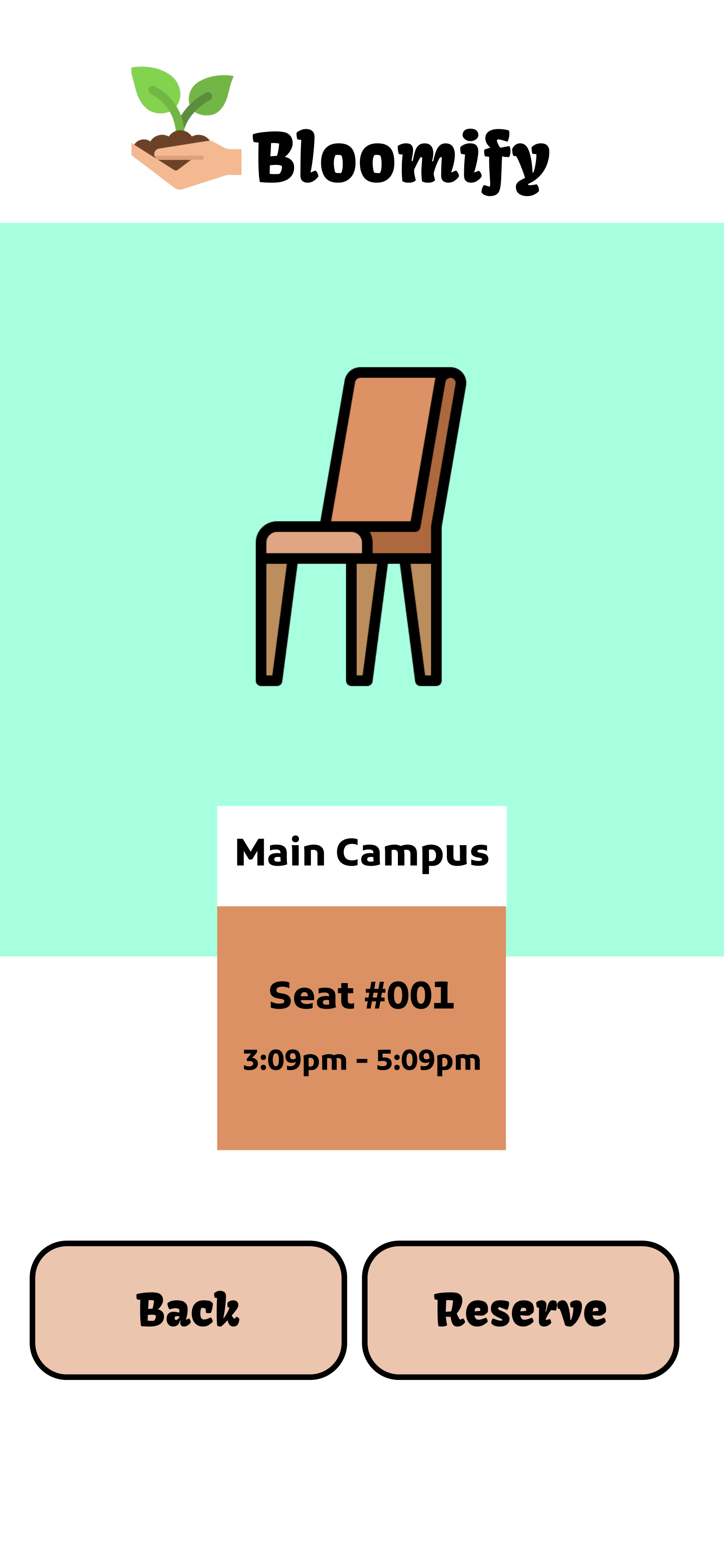
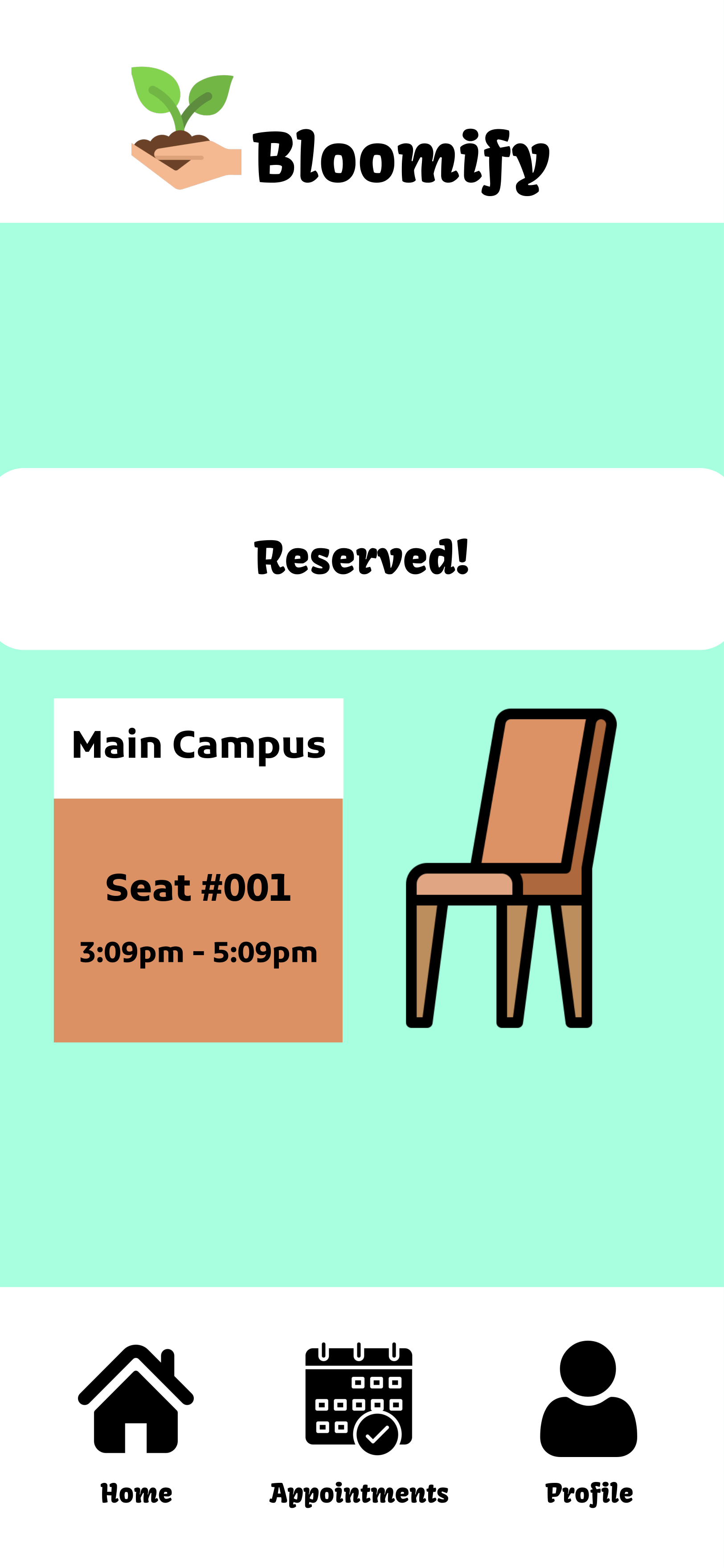
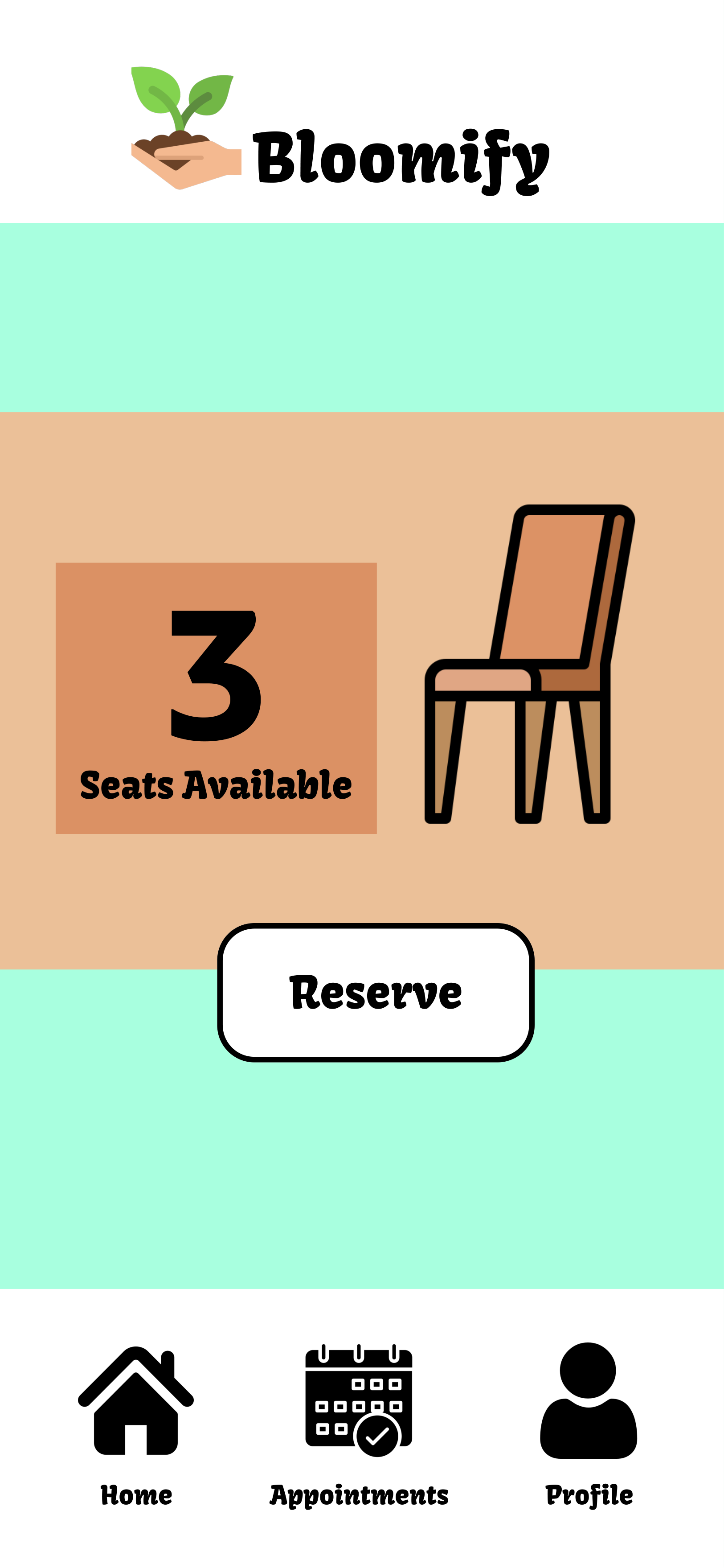
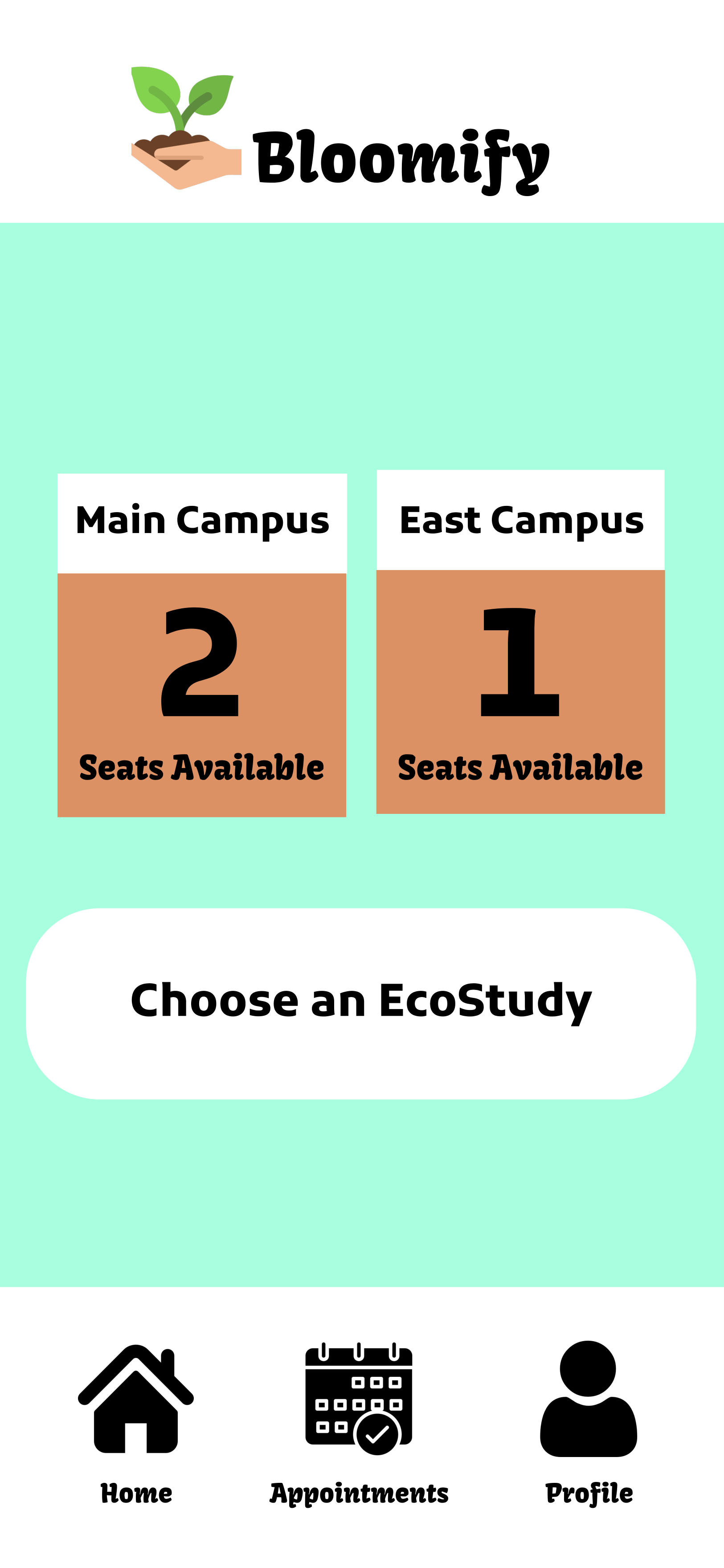
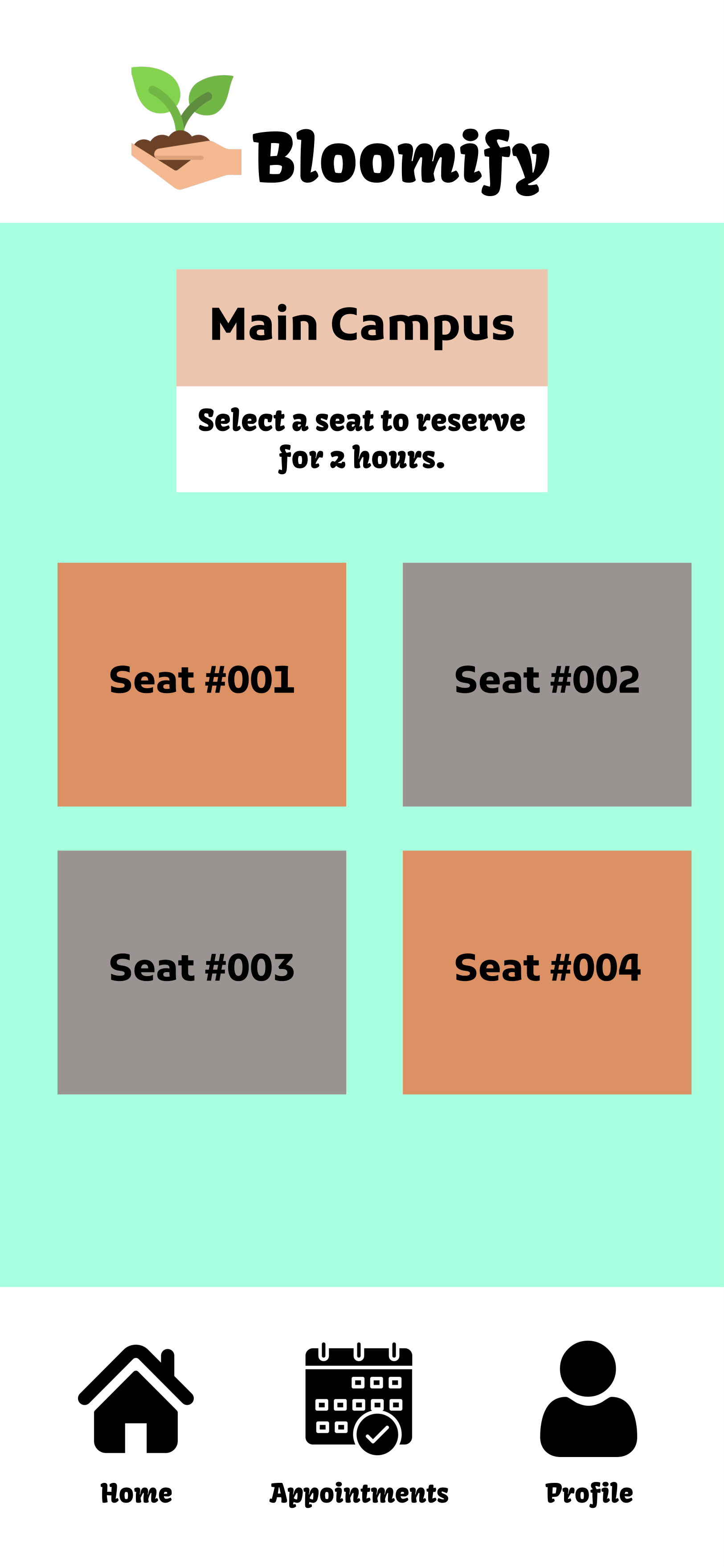
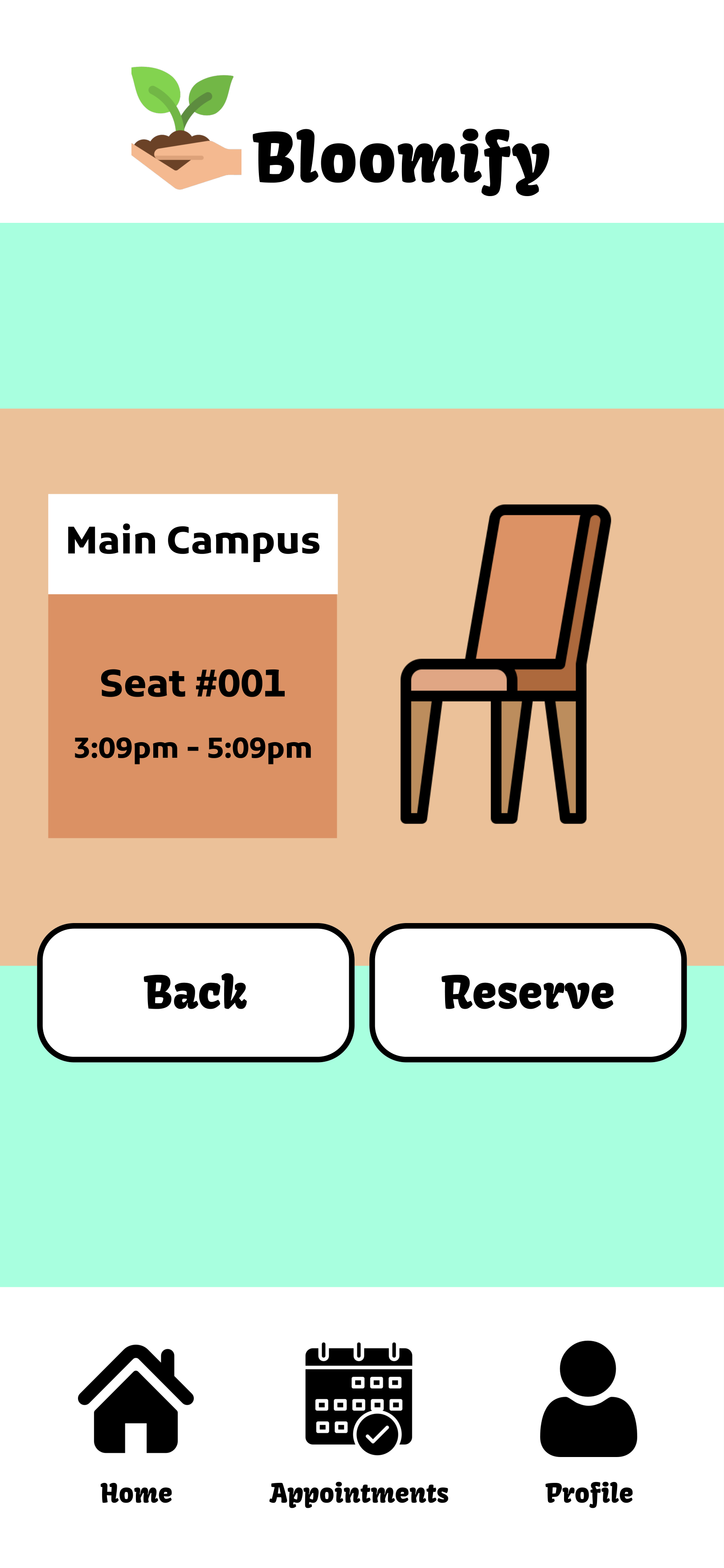
The reserve a seat feature, the user is displayed with how many seats in general are open. It'll then show how many are available for Main and East Campus. The user then selects a seat and gets to reserve it for 2 hours.
Personal Goals: Have a navigation bar available for every page, and a better indication that a seat has been reserved.
Credit to icons: https://www.flaticon.com/
User Testing Prototype #1
Tasks:
- “Your first task is to complete the daily survey, in order to access the other features of the app. Go ahead and fill it out”
- Your second task is to reserve yourself a seat in the Main Campus Ecostudy. Check to see if there are seats available, and reserve yourself one.”
- “Your third task is to make an appointment with a CU counselor. See what days work for you, then pick a time, then confirm your appointment.”
- “Your fourth task is to check your personal survey data, from this week.”
- “Your final task is to double check your reservations.”
About the User: Student at the University of Colorado, Aerospace Engineering Major, Early 20's, Female
Questions:
- “Did you think the survey questions were helpful for checking in on you? Would you prefer a different set of questions?”
- “Was it easy to reserve a seat? Would you prefer to walk up to an EcoStudy to check how full it is, or would you rather check via the app?”
- “Was this an easier way to schedule a counseling appointment than the usual method? If so, would you use this to access CU’s mental health resources more often? If not, do you have any concerns about scheduling appointments through an external tool?”
Feedback:
- She enjoyed looking at the data throughout the week, she thinks a simple check in was good to reflect on herself and it was nice and quick.
- She said the app is good, because whenever she goes somewhere to study it’s a “gamble” where there's a good chance there isn’t a spot. It’s very time consuming and you have to do laps without the app.
- “The app is way easier, I’m already signed in and I don’t have to keep clicking and scrolling to find an appointment/make one. The website has too much reading, when I’m stressed I don’t feel like reading.”

Prototype #2
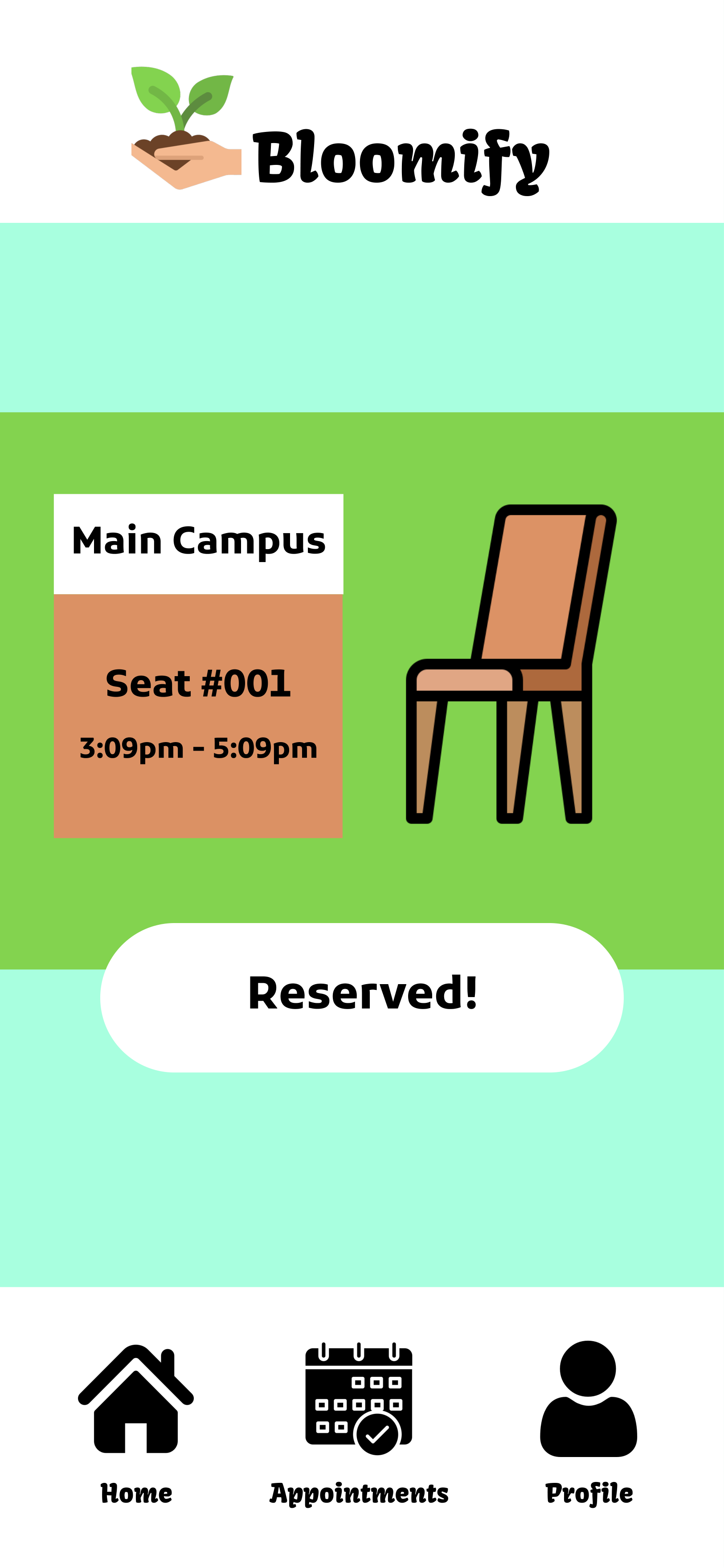
In the pictures displayed are the panels I specifically worked on.
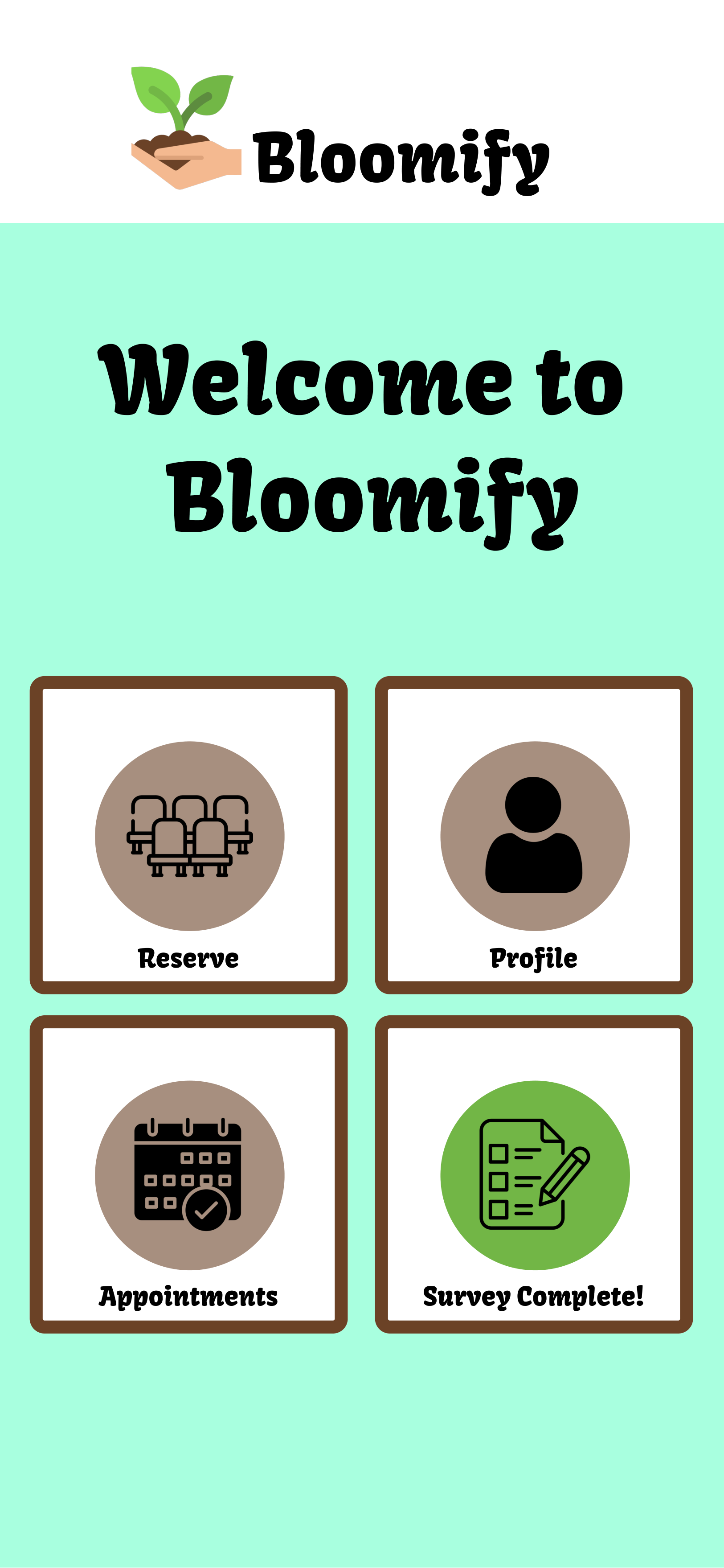
The reserve a seat feature, now has a navigation bar that now appears consistently on all pages within the feature. This enhancement ensures easy access and smoother navigation.
Additionally, I've added a visual indicator for successful seat reservations. When users complete the reservation process, a green backdrop appears, offering immediate confirmation. This improvement enhances user experience by providing clear feedback and making the reservation process more engaging.
Personal Goals: Adding a backdrop onto the seat selection page might keep things more together, I also was thinking about getting rid of the first page of the reserve a seat feature.


