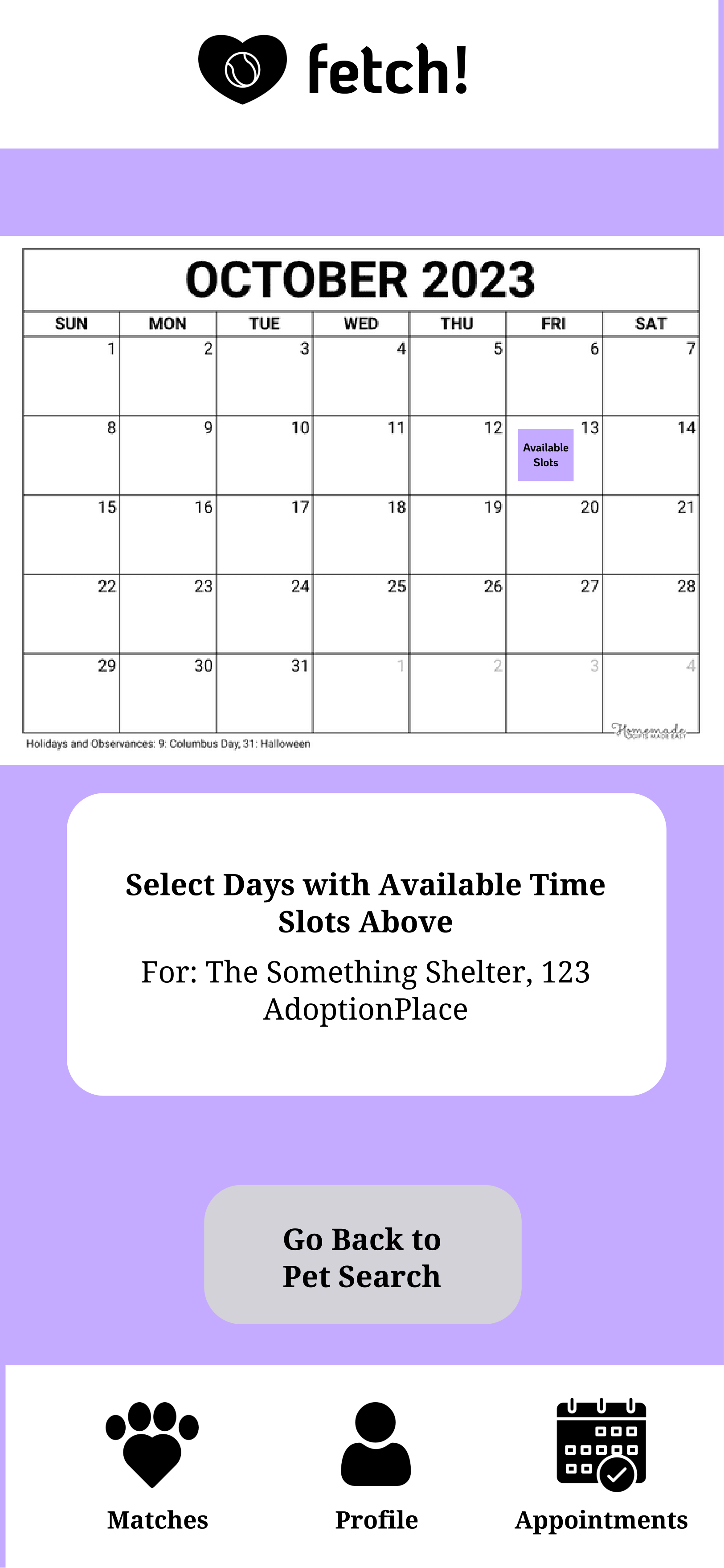
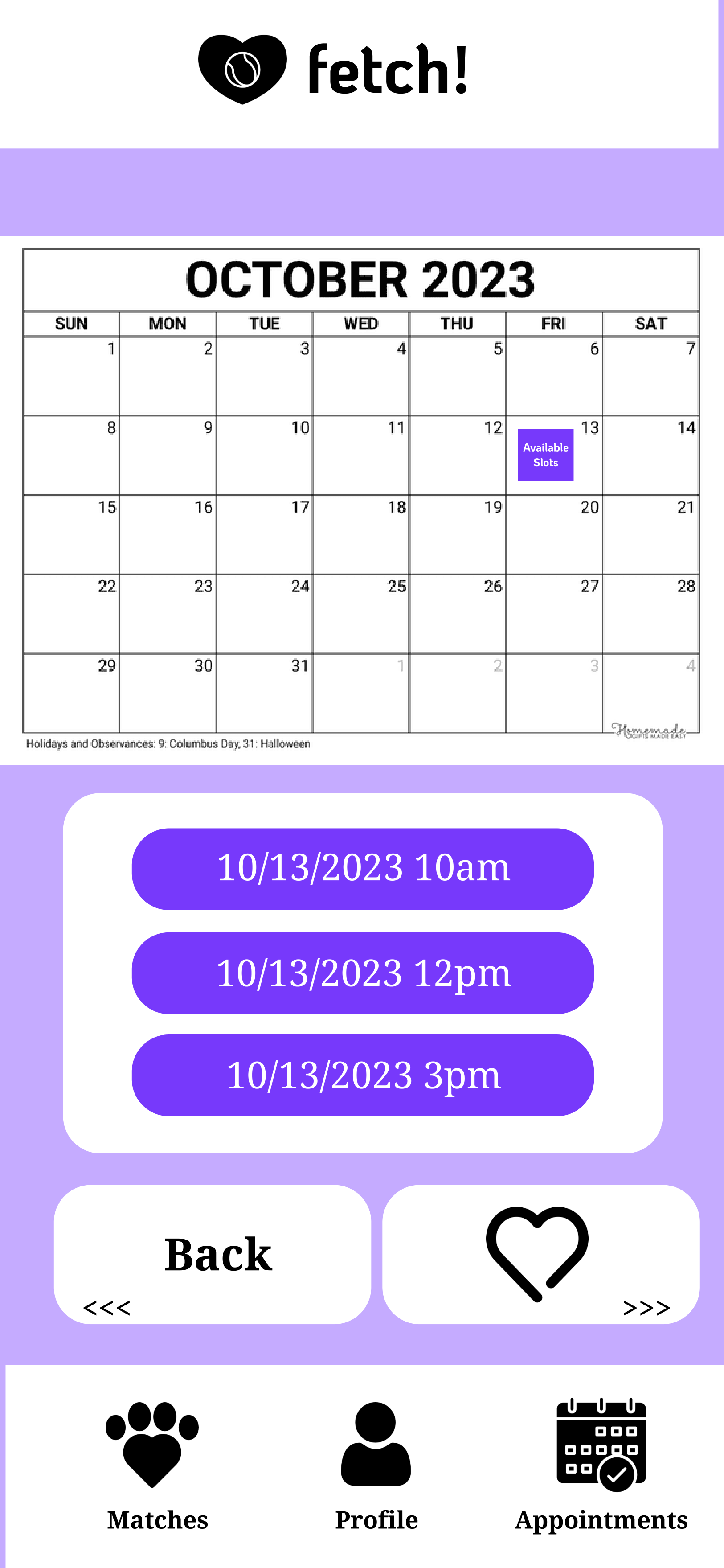
The app fetch! is a matchmaking platform for individuals seeking a new pet. Users complete a brief survey covering allergies, living arrangements, commitment level, and pet preferences. Based on their responses, the app generates a feed showing various pet options.
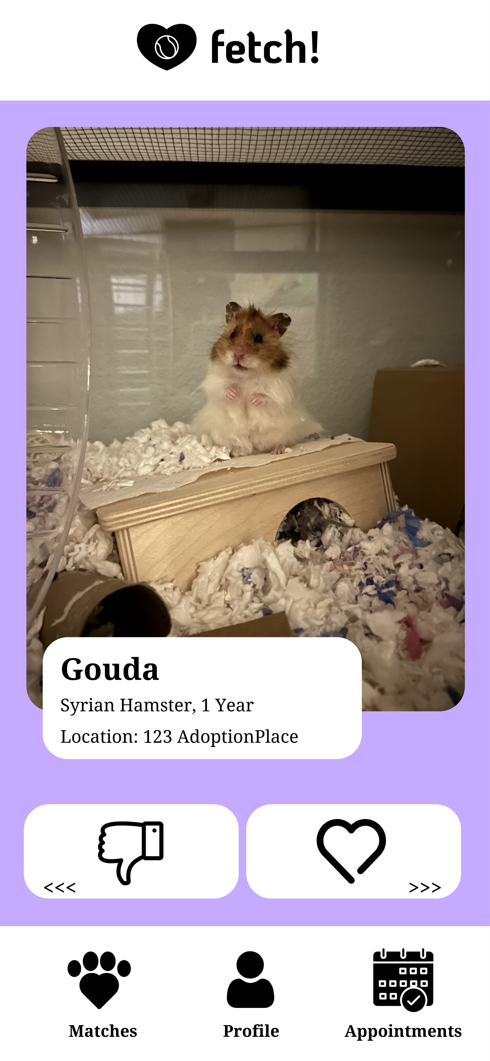
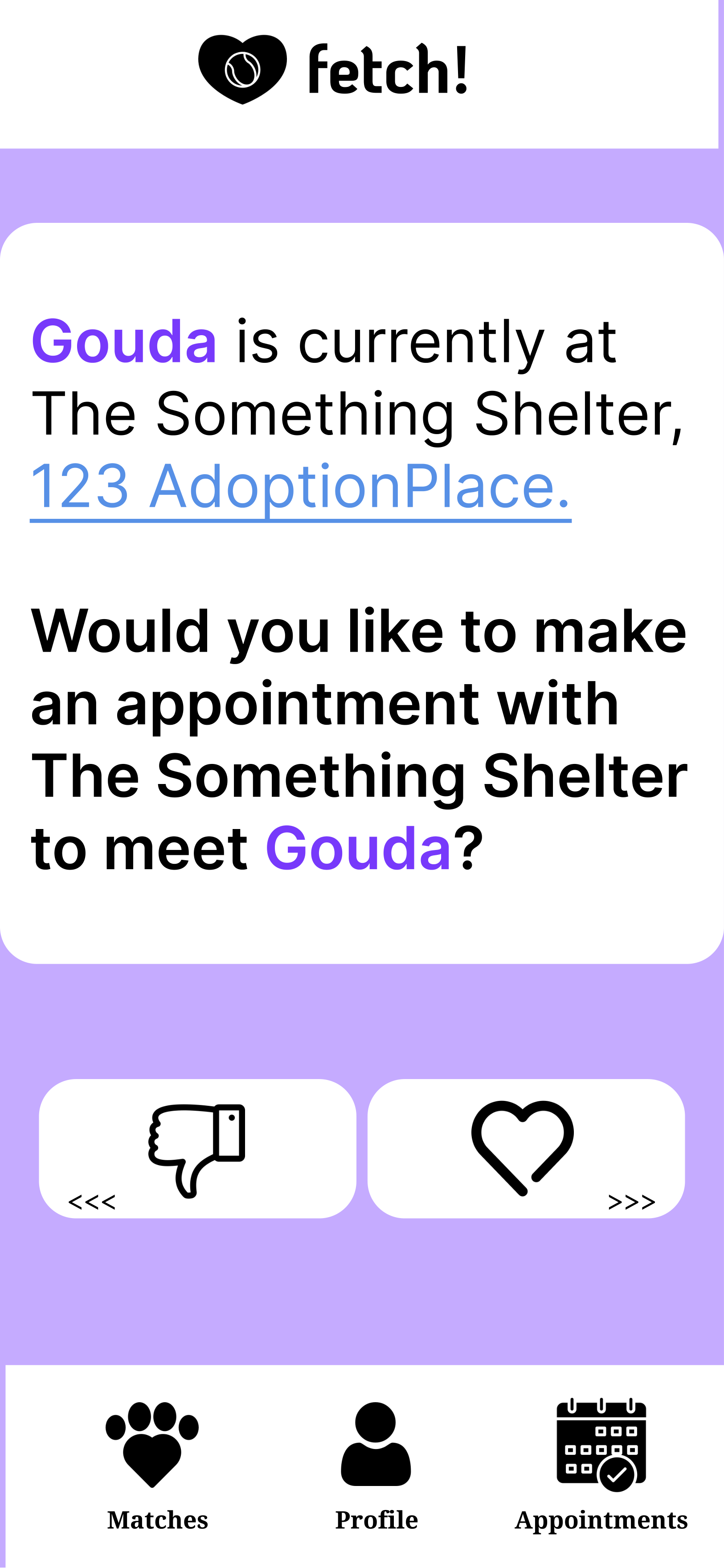
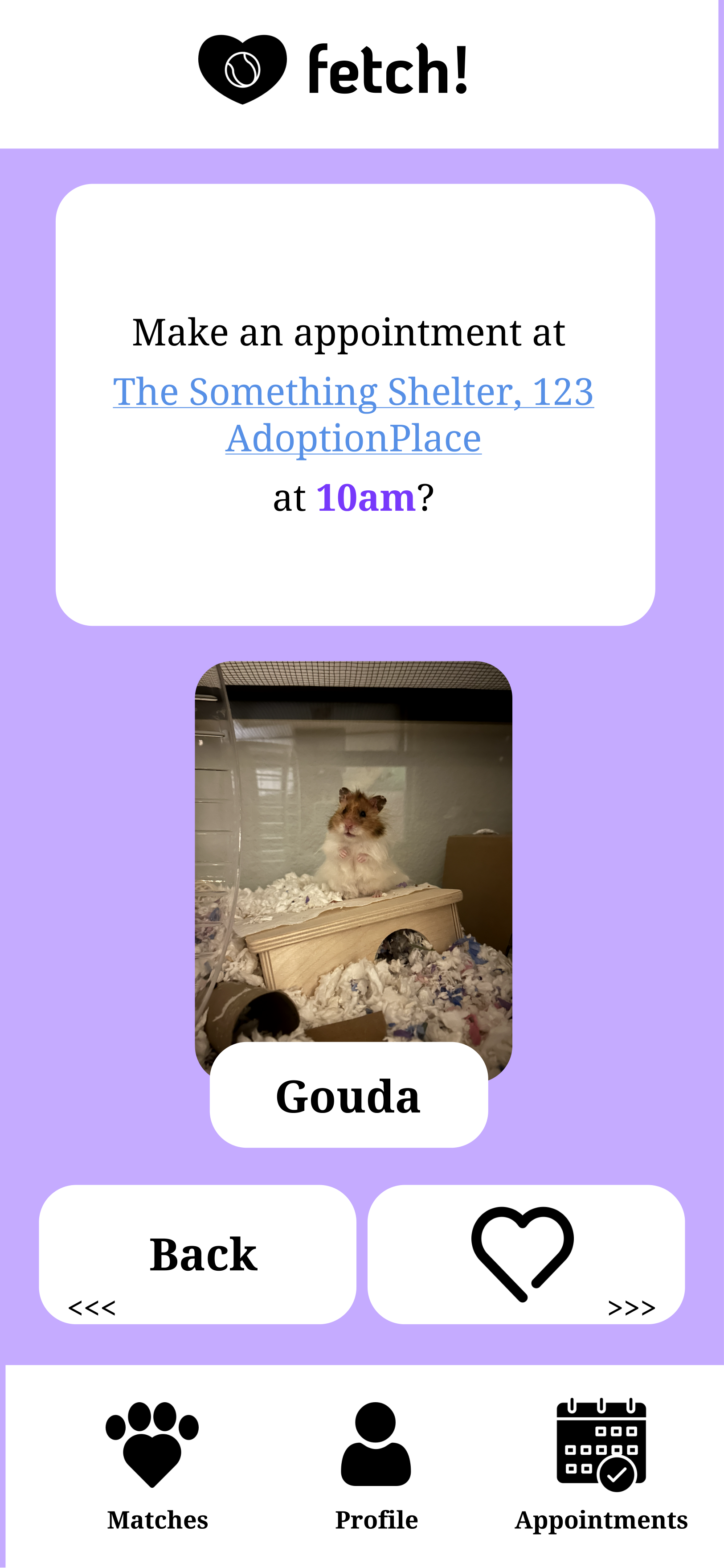
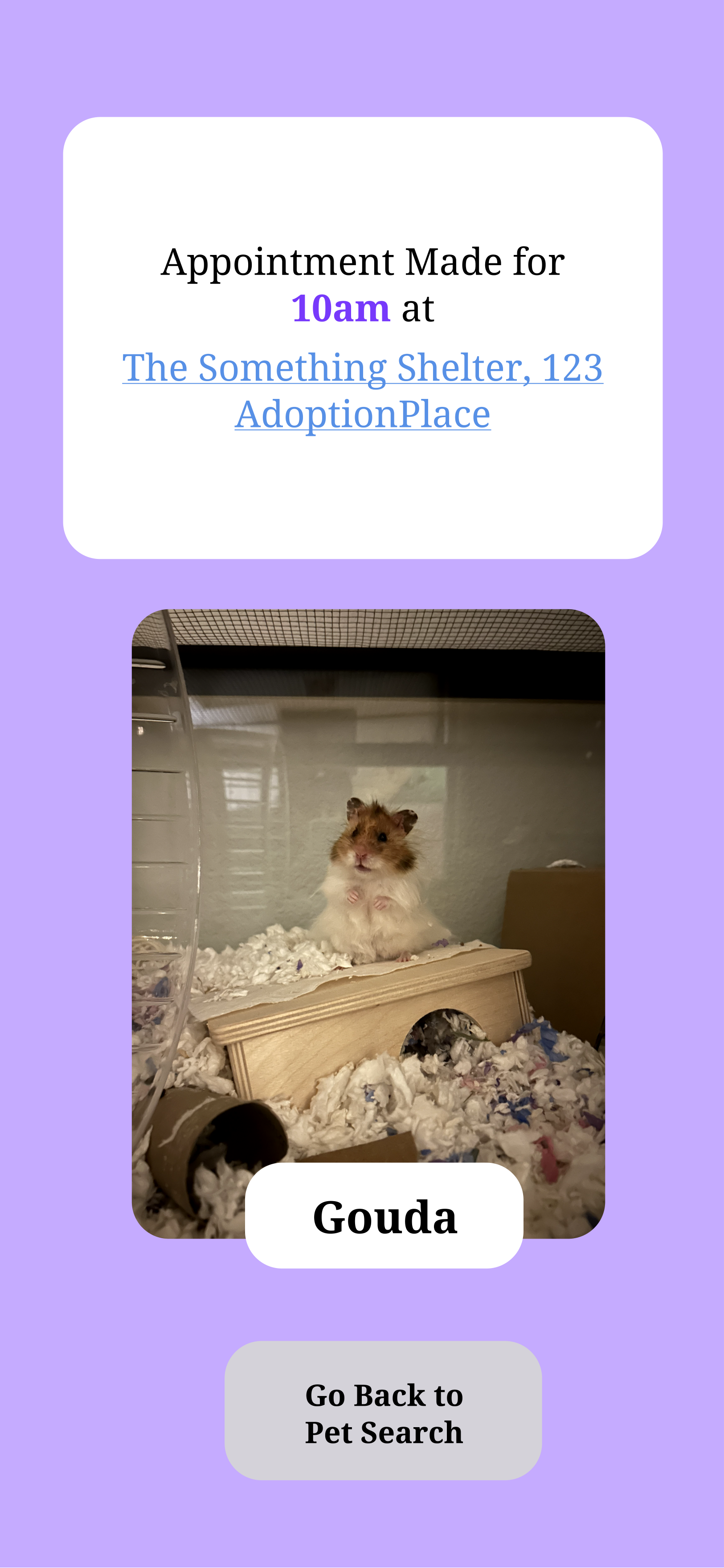
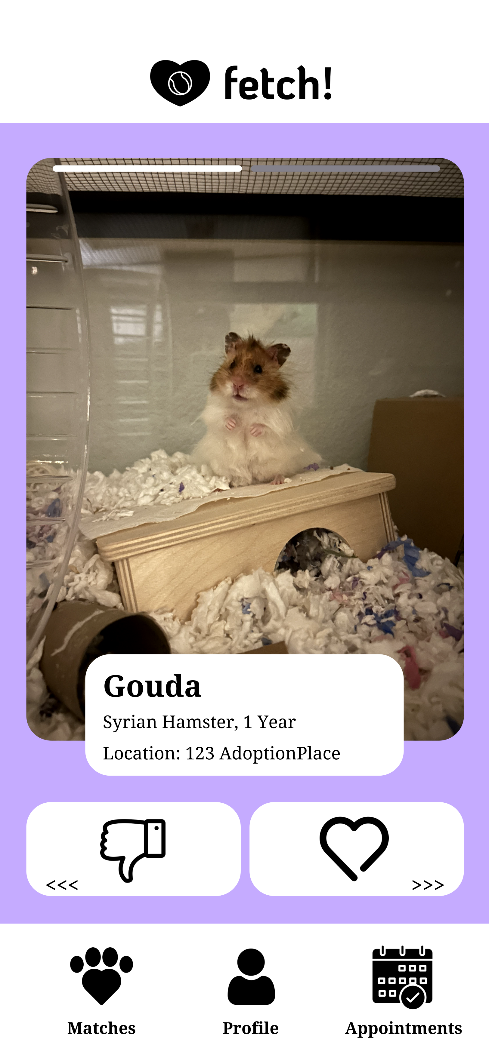
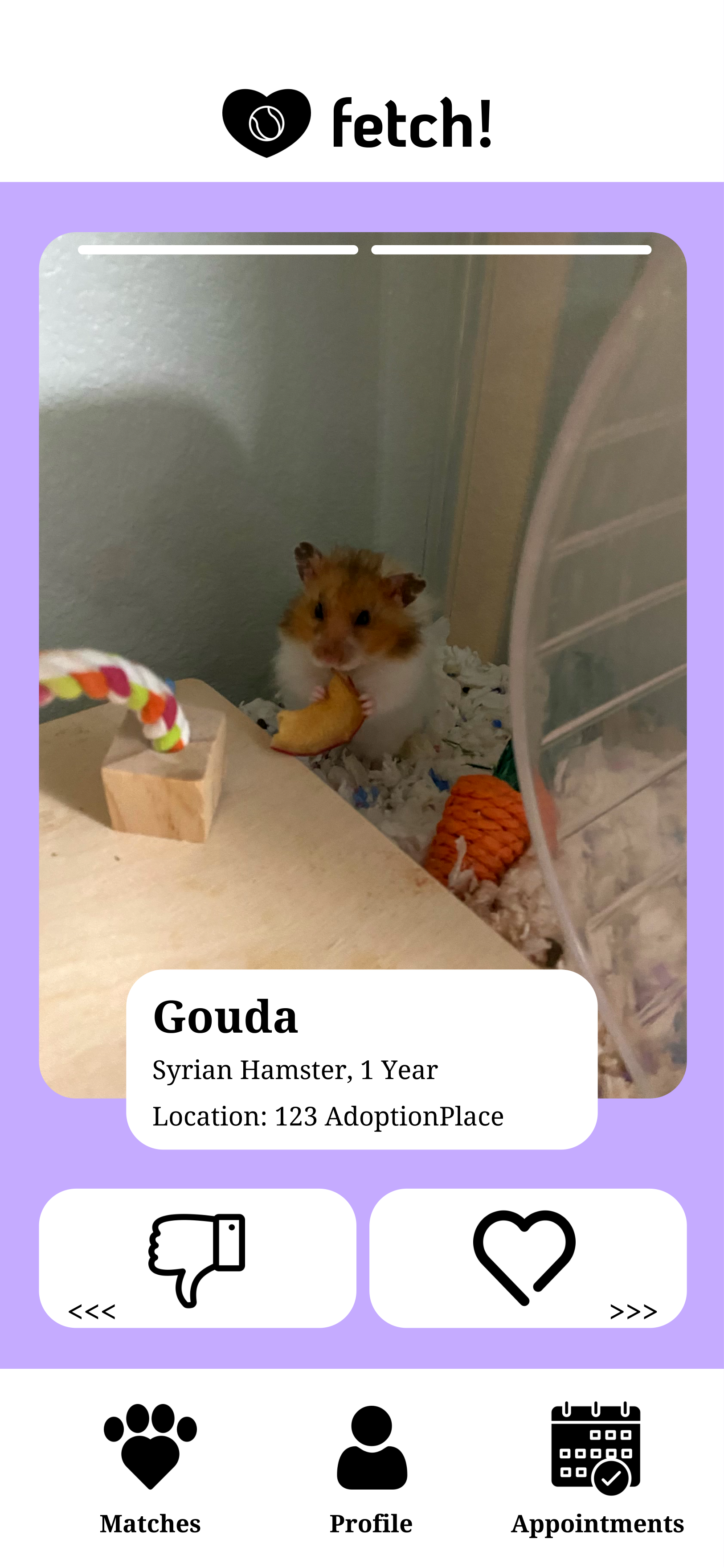
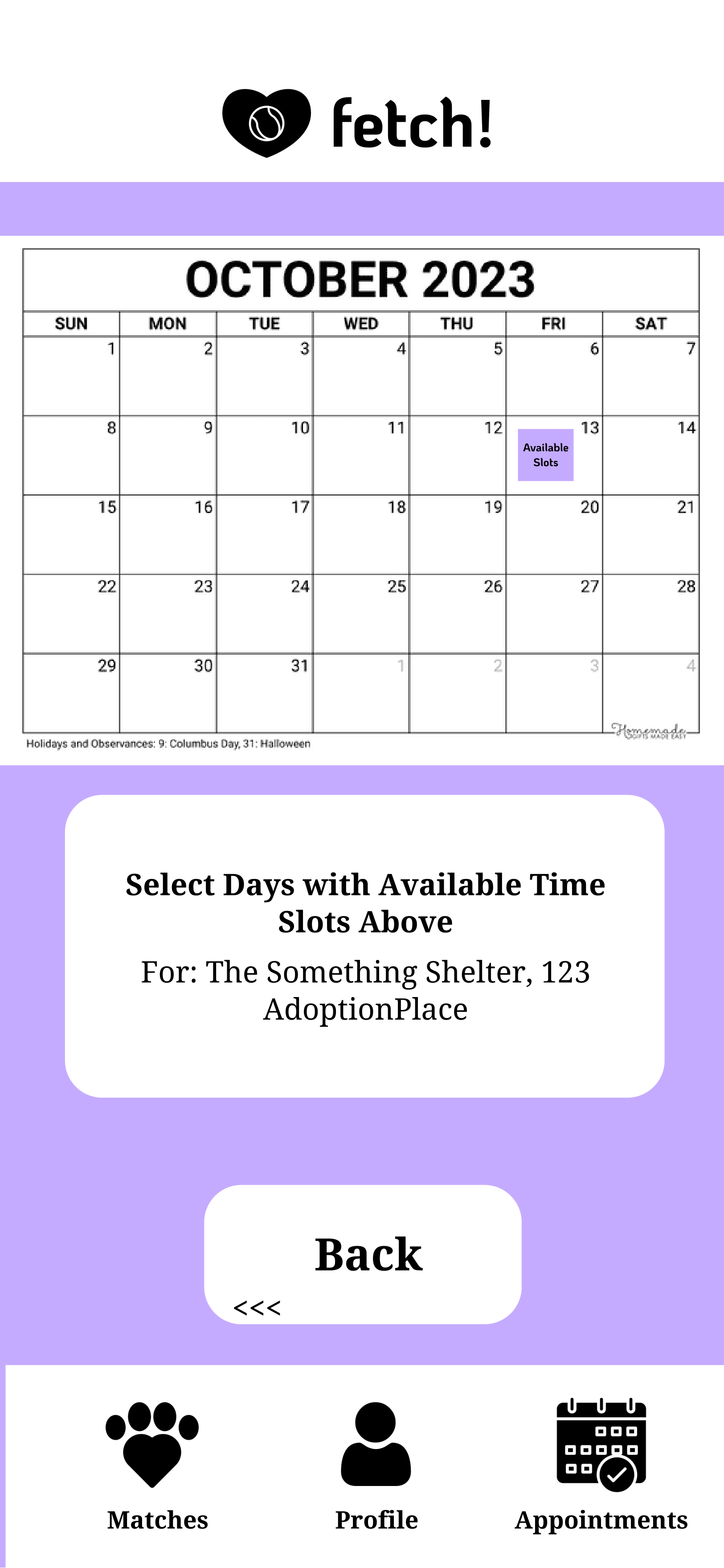
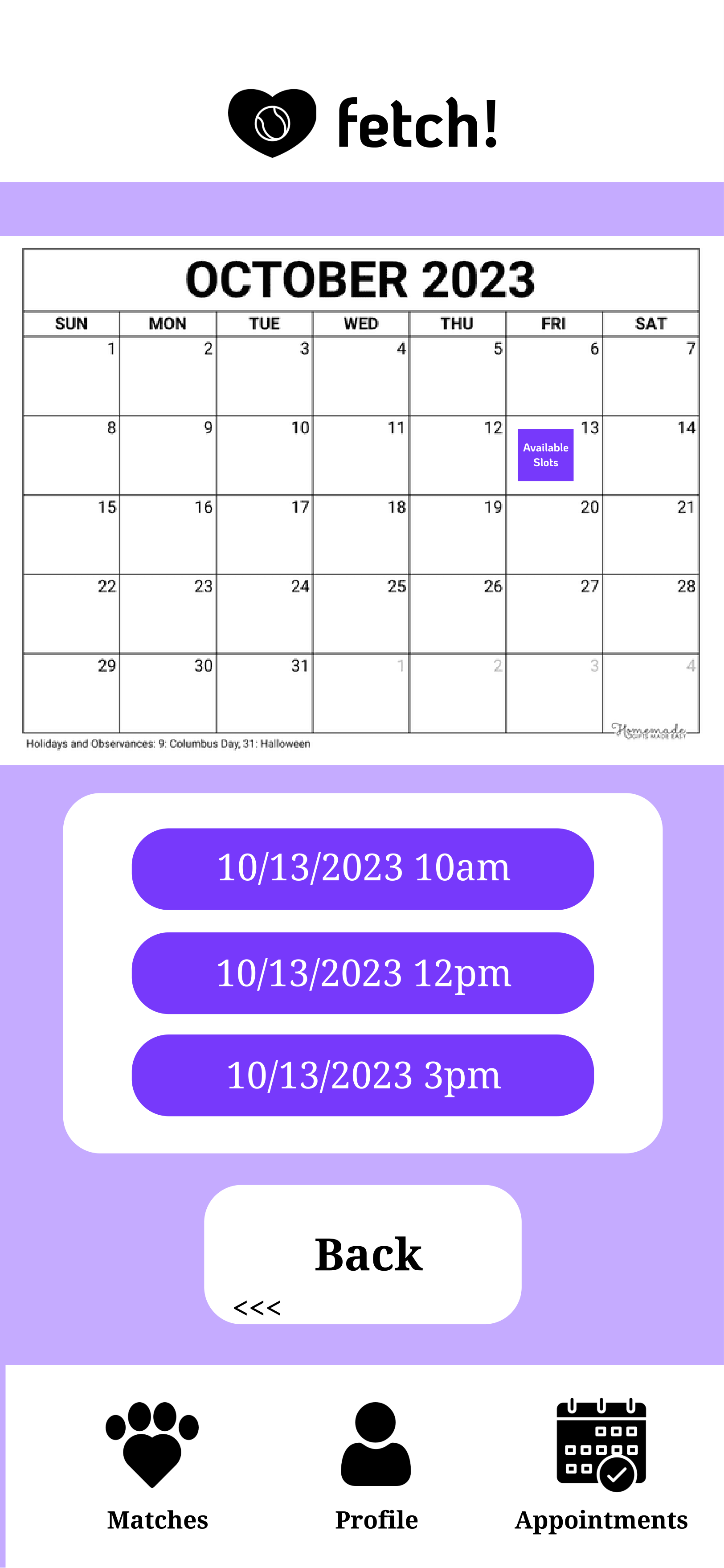
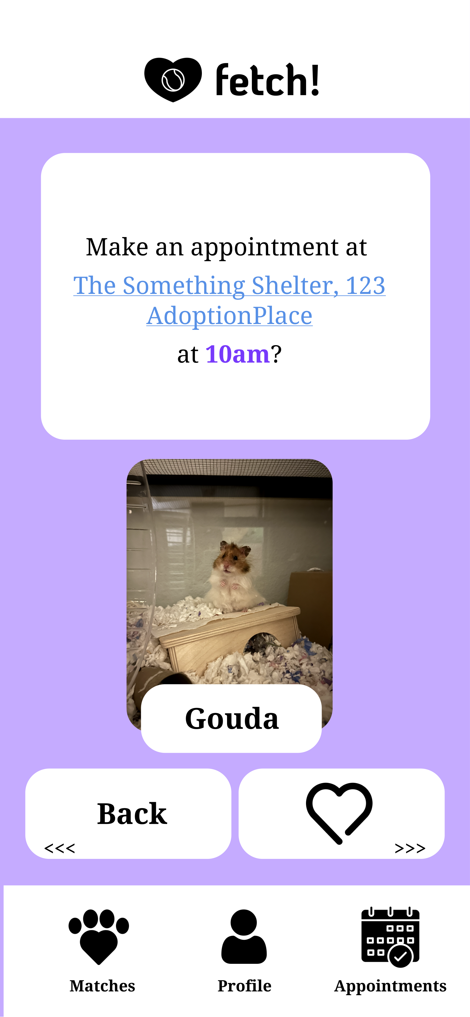
Users can swipe through pet profiles, indicating interest (swipe right) or disinterest (swipe left). If a user swipes right, they gain access to information on how to meet the pet and can schedule a meet-and-greet.
fetch! simplifies the process of finding a compatible pet for someone who doesn't know where to start.
Problem Space
Problem: Many people enjoy a pet companion, but they often lack knowledge on finding the right match or where to begin their pet search.
Audience: People interested in becoming a pet owner.
Solution: An app that helps people find their future pet.
Research
In my prototype, I want to be consistent with the universally recognized swipe gestures (swipe right/left), like the in popular matchmaking platform Tinder, Bumble, and Hinge. This will make users feel familiarity and ease of use.
When reviewing popular adoption websites, I've noticed they involve too many steps to reach the desired outcome, along with cluttered interfaces that can include ads and irrelevant information. My goal is to design a prototype that is simple and straightforward, so an app is still a favorable solution.
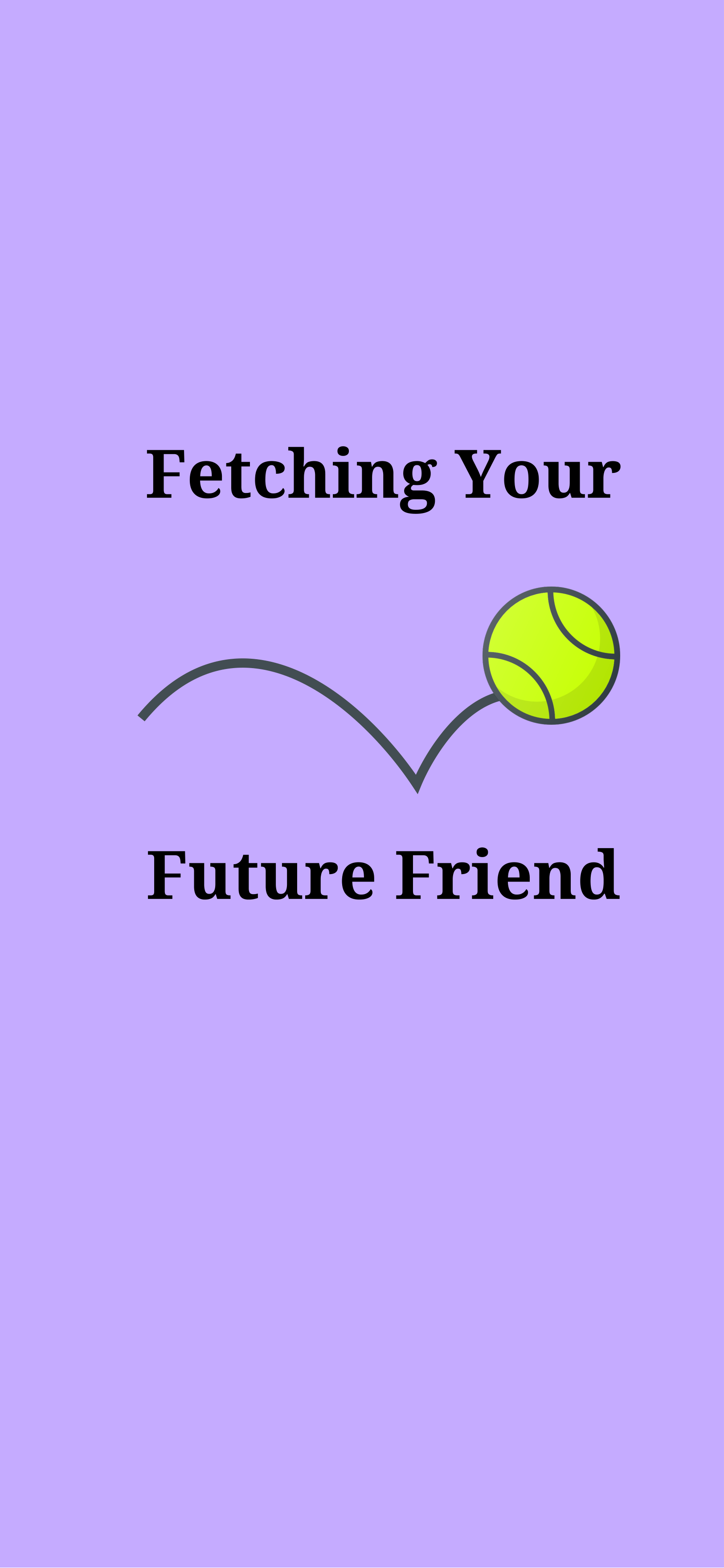
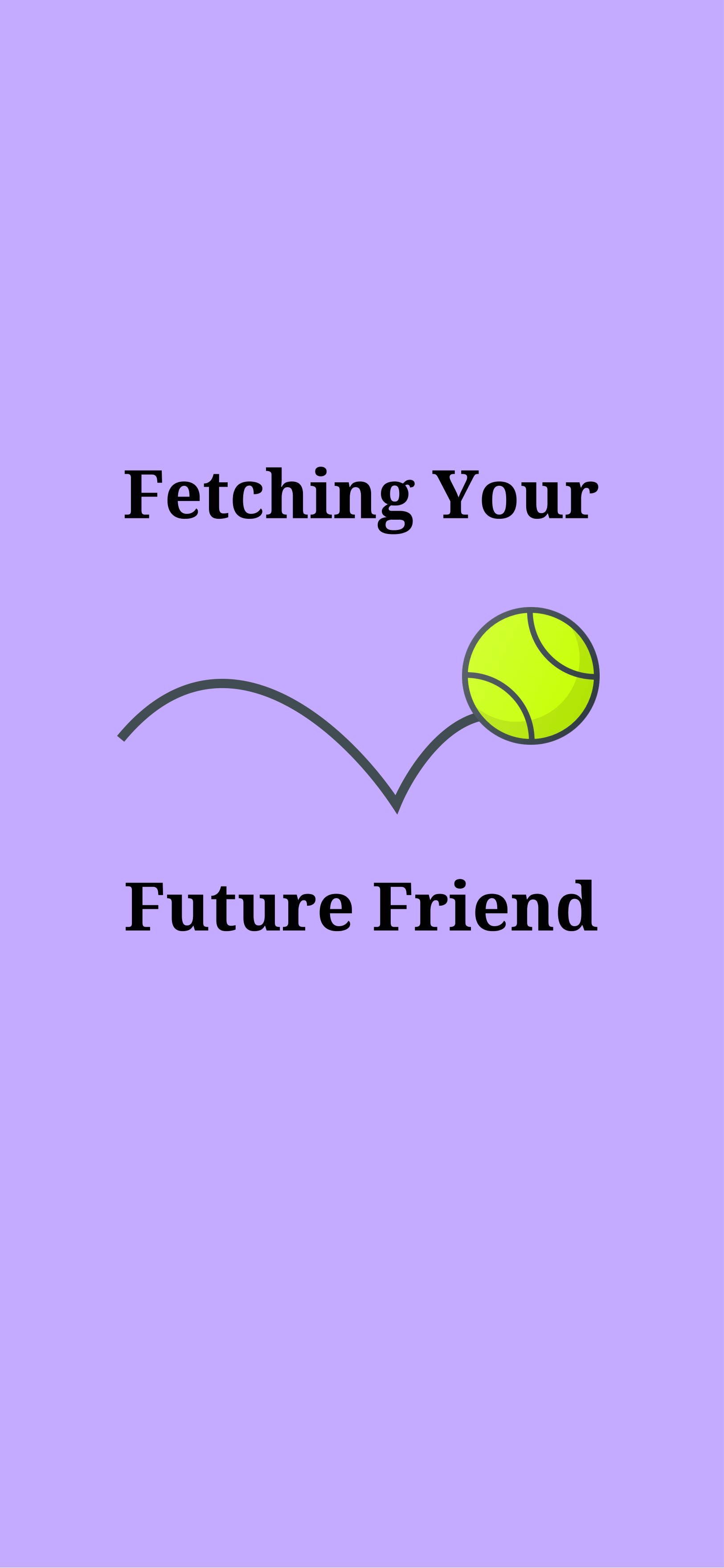
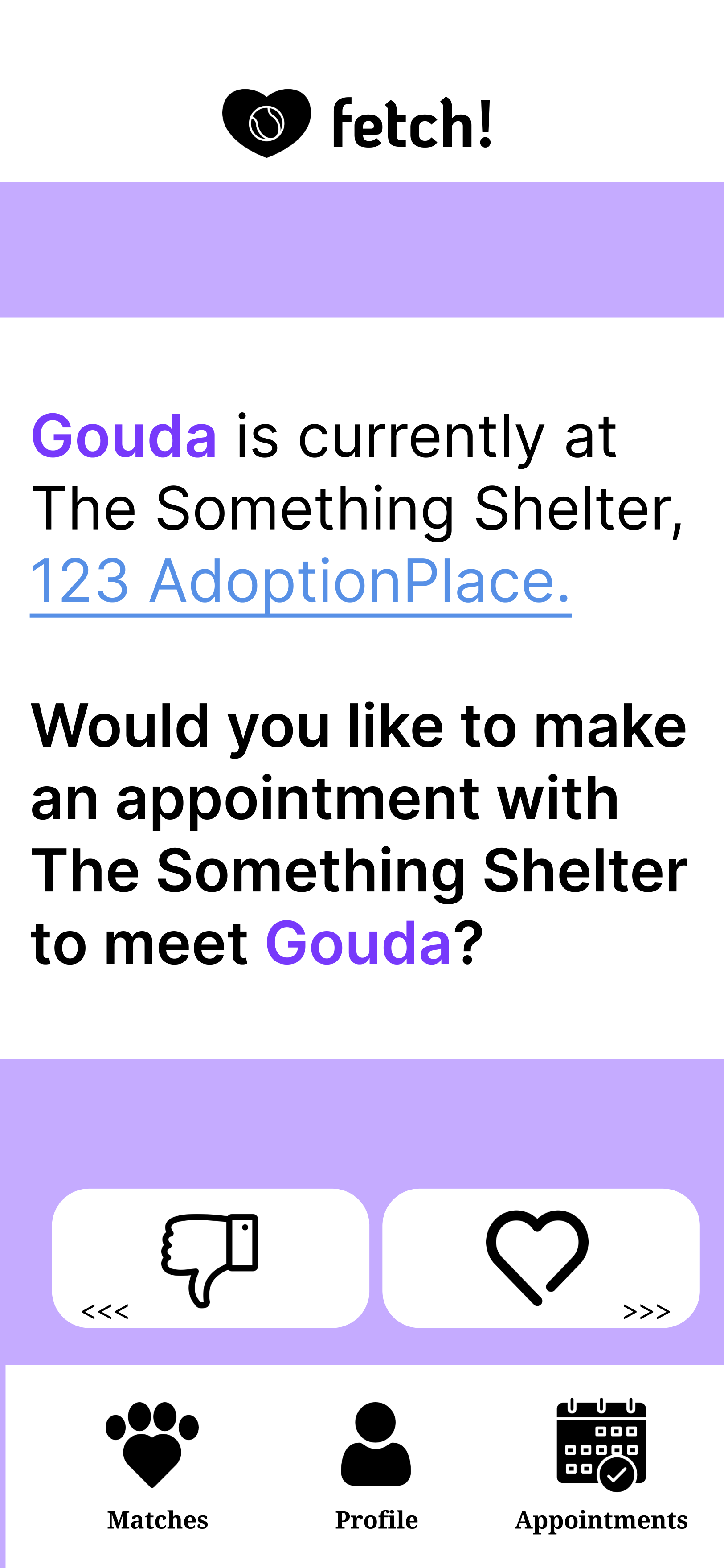
Prototype #1
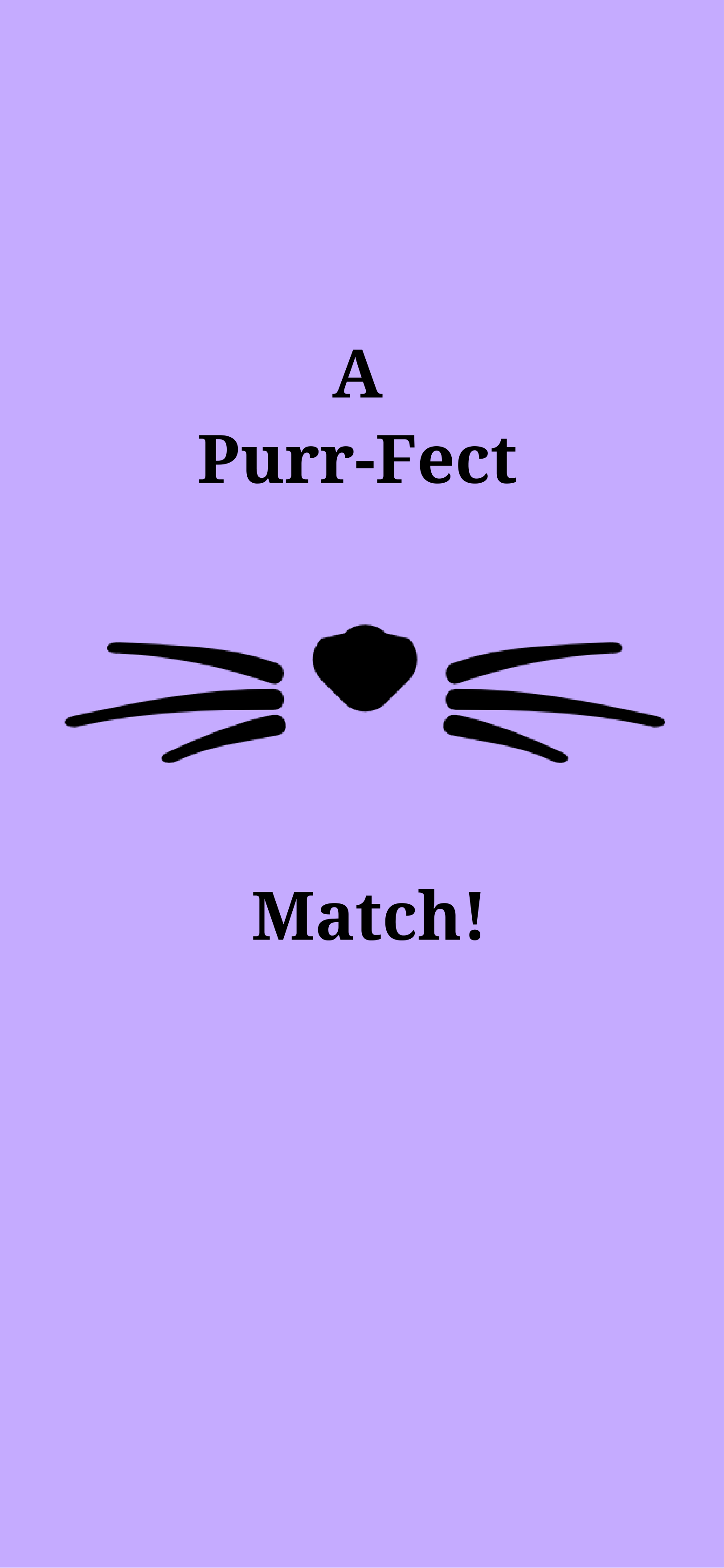
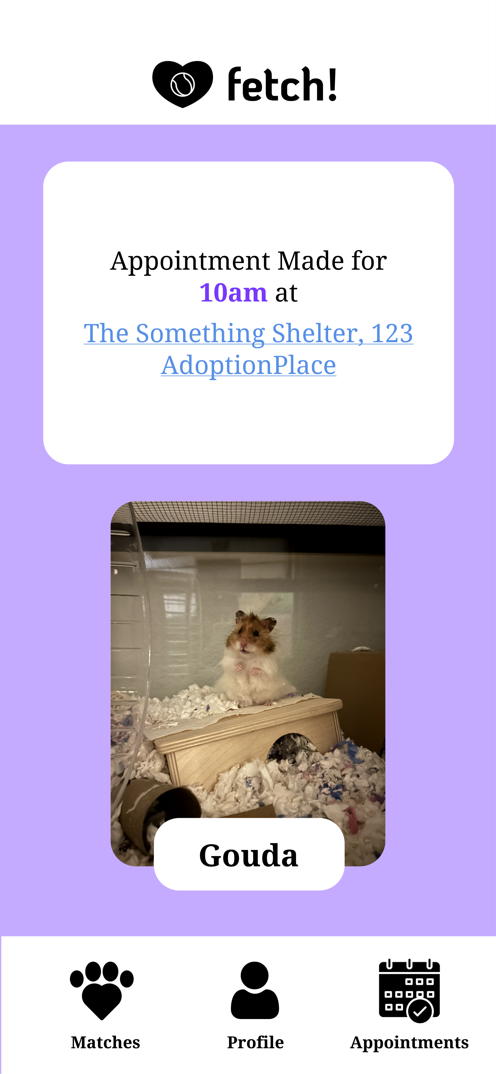
The focus of my app lies in the matchmaking process. In the prototype, it includes "Gouda" my hamster, engaging puns, and consistency. Additionally, users have the flexibility to exit the app at any time, because of the availability of a navigation bar. The matching with a pet is created with minimal steps, ensuring users don't encounter frustration. This simplicity increases the likelihood of users to successfully find a pet, which is the end goal.
Personal Goals: I made this Figma quickly, so moving things to be more aligned and center is something I plan to change, and I don't like that the navigation bar is not on the last page.
Credit to icons: https://www.flaticon.com/
User Testing Prototype #1
Task: Find a pet match and make an appointment to meet them.
About the User: College student, male, age is early 20's
Feedback:
- Tapped the arrow, instead of just swiping
- Enjoyed the puns
- Had the question of, "if making the appointment means the first time meeting the pet, and if they can adopt the same day"
- Wanted to know how many people were looking at pet
- How long do your matches stay? And how do I know if they’ve been adopted?
- Enjoyed the puns
- Had the question of, "if making the appointment means the first time meeting the pet, and if they can adopt the same day"
- Wanted to know how many people were looking at pet
- How long do your matches stay? And how do I know if they’ve been adopted?
Feedback Conclusion: The user really enjoyed my icons and felt that it’s intuitive. He enjoys the puns and the loading screens, and the title overall. He likes that “fetch!” (the name of my app) if at the top of my screen, but recommends moving it down because the iphone camera blocks fetch!. The user also was thinking about being able to add multiple photos for a pets profile.
Revision notes:
- Make it clear if it’s the first time meeting/ can adopt this day
- Location on original profile/how far away
- More clear on the availability of the pet - ie the profile
- Have your pet matches disappear if after 2 months/got adopted
- Have a little swipe word underneath the arrows
- Maybe condense the date/time when making an appointment
- Location on original profile/how far away
- More clear on the availability of the pet - ie the profile
- Have your pet matches disappear if after 2 months/got adopted
- Have a little swipe word underneath the arrows
- Maybe condense the date/time when making an appointment
Prototype #2
In Prototype #2 I aligned and centered items to give a more polished look. Every landing page now is equipped with a navigation bar for easy exit and access to other pages. Along with that I got rid of some unnecessary buttons and added a feature to tap through "Gouda's" images.
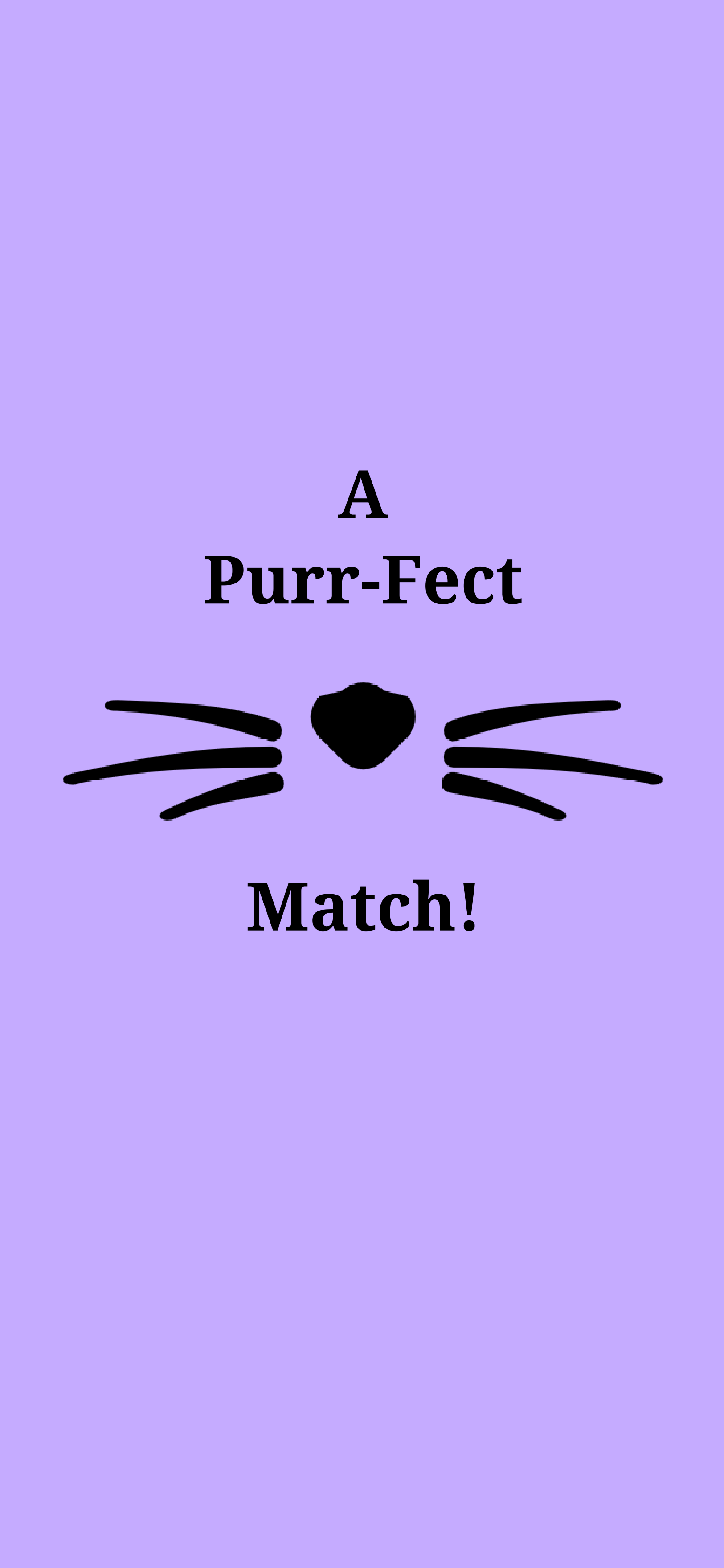
Personal Goals: I feel after the "Purr-Fect Match" page, the appointment making pages feel congested and unorganized. In the future I want to give a more professional look to it. Adding how many people have matched with the pet would be important, so prototype #3 will show how many matches "Gouda" has in his description.
Credit to icons: https://www.flaticon.com/
More fetch! prototypes coming soon!


